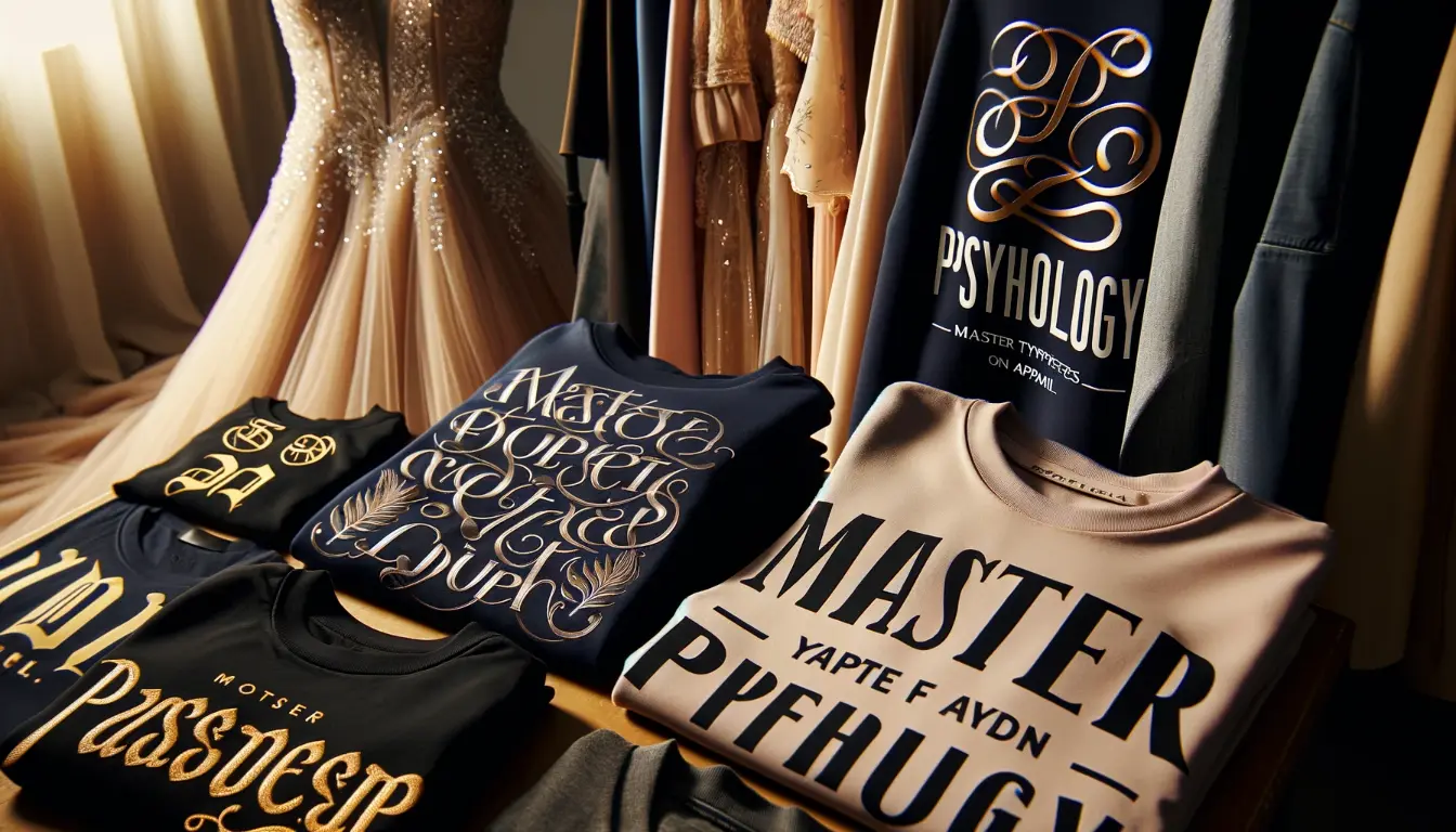
Every clothing brand tells a story, and believe it or not, the font you choose is whispering secrets about your style. Maybe you’ve seen two t-shirts with the same phrase, yet one seems edgy while the other feels classic – ever wonder why? That’s font psychology at work! If choosing the right typeface for your apparel line feels more perplexing than picking out a perfect pair of jeans, you’re not alone.
Did you know that some fonts can actually make your message stand out and stick in people’s minds better than others? It’s true! Fonts do much more than just display text; they evoke emotions and create connections.
This article will dive into how different typefaces on clothing can speak volumes to customers before they even read what’s written. You’ll learn how to master these silent communicators to give your brand that extra oomph.
Ready to transform your threads with typography? Keep reading – this could be game-changing!
Key Takeaways
- Different fonts tell a story and shape how people see your brand.
- Serif fonts look traditional and trusted, while sans serif fonts appear modern and simple.
- Script fonts add elegance to clothes; display fonts show off your unique style.
- The size, style, and color of the font can guide eyes and make messages stand out.
- Using the right font creates an emotional bond with customers and sets you apart.
Font Psychology and Brand Identity
Typeface choices play a crucial role in shaping brand perception and identity. Different typeface families have distinct psychological effects, influencing how consumers perceive and connect with a brand.
Understanding the impact of typography on brand identity is essential for creating visually appealing and engaging apparel designs.
Typeface choices and brand perception
Fonts are powerful tools in creating a brand’s image. Choose the right font, and customers might see your brand as strong and reliable. Go with something elegant like script fonts, and suddenly you’re luxurious and high-end.
Brands know this well; that’s why they carefully pick typefaces that reflect their personality—be it classic serif fonts for trustworthiness or sleek sans serif fonts for a modern vibe.
A font can make or break how people feel about your logo design or advertising. Use Times New Roman or Baskerville, you’re seen as traditional and respected. Pick Helvetica or Open Sans, you come off as clean and no-nonsense.
Every choice sends a message to your target audience, shaping their thoughts about who you are as a brand before they ever interact with your product.
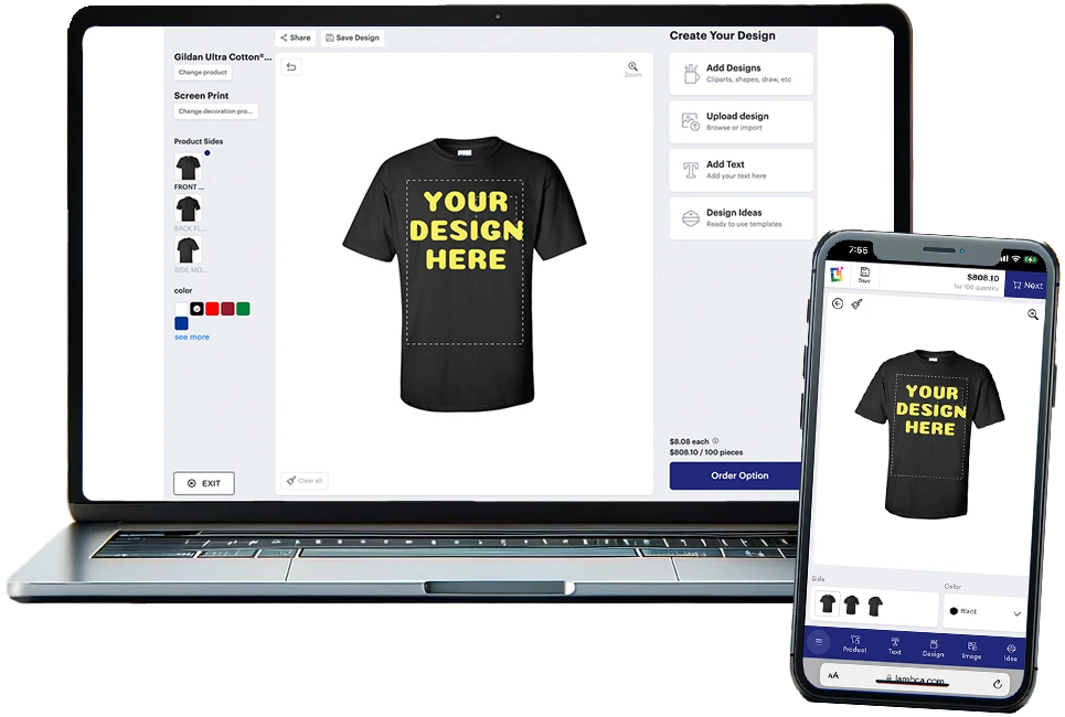
DESIGN YOUR OWN APPAREL
FREE SHIPPING
Custom screen printed shirts and apparel
Psychological effects of different typeface families
Typeface families play with our emotions. Serif typefaces, like Times New Roman or Caslon, have a classic touch that brings up feelings of reliability and respectability. They remind us of the times when newspapers and books were our main information sources.
Brands looking for an air of sophistication often pick serif fonts to send a message of established credibility.
Sans serif fonts such as Arial or Calibri feel clean and no-nonsense. They are straightforward, making them perfect for modern brands that want to appear innovative and approachable.
Such fonts strip away the frills to focus on clarity which is why tech companies love using them. Moving on, let’s explore how different typefaces operate in various contexts and what this means for your brand identity.
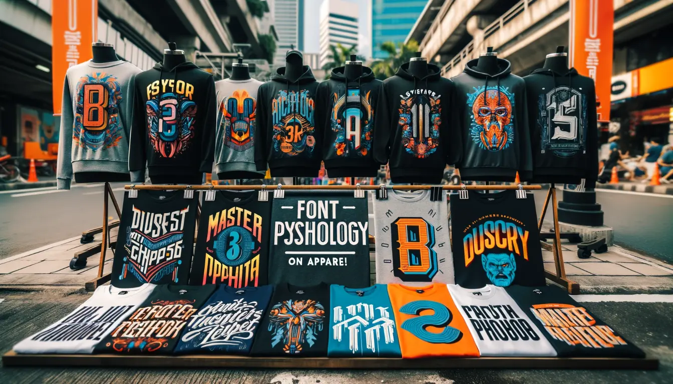
The Role of Different Typeface Families
Different typeface families play a significant role in conveying brand identity and perception. Serif fonts exude authority and tradition, while sans serif fonts convey modernity and simplicity.
Script fonts add elegance and creativity, while display fonts make a bold impact and emphasize individuality. Each typeface family has its own unique personality that can greatly influence the message being communicated to the audience.
Serif fonts: conveying authority and tradition
Serif fonts stand tall with elegance, carrying a rich history in their strokes. Think about the last time you picked up a book or read an official document; chances were, it was written in a serif typeface.
This kind of font has little feet at the end of each letter, known as “serifs.” These tiny details add sophistication and make text easy to follow on paper.
Brands choose these fonts to show they are serious and stable. If you see a company logo with serif letters, it might feel more traditional than one with simple lines. That’s because serifs have been around for centuries and remind us of old-school newspapers and important documents.
They help brands come across as trustworthy and professional—qualities that never go out of style.
Sans serif fonts: exuding modernity and simplicity
Sans serif fonts exude modernity and simplicity, making them a popular choice for brands aiming to convey a contemporary and minimalist look. They are known for their clean lines and lack of decorative flourishes, which contribute to their sleek and straightforward appearance.
Utilizing sans serif fonts can instantly create a sense of modernity and simplicity in design, appealing to audiences looking for an uncluttered and progressive feel in branding.
The use of sans serif fonts is backed by the fact that they are commonly associated with these qualities, making them an effective tool for communicating a brand’s innovative and uncomplicated image.
Harnessing this font family can significantly contribute to the perception of a brand as being forward-thinking and approachable while maintaining an air of sophistication. Remember that choosing the right typography is crucial in building a strong visual identity..
WE HELP YOU MAKE AMAZING CUSTOM PRINTED TEES & APPAREL!
CUSTOM IS COMPLICATED
WE MAKE IT EZ
Let our dedicated team help guide you! Click below to send us basic information to get your order started!
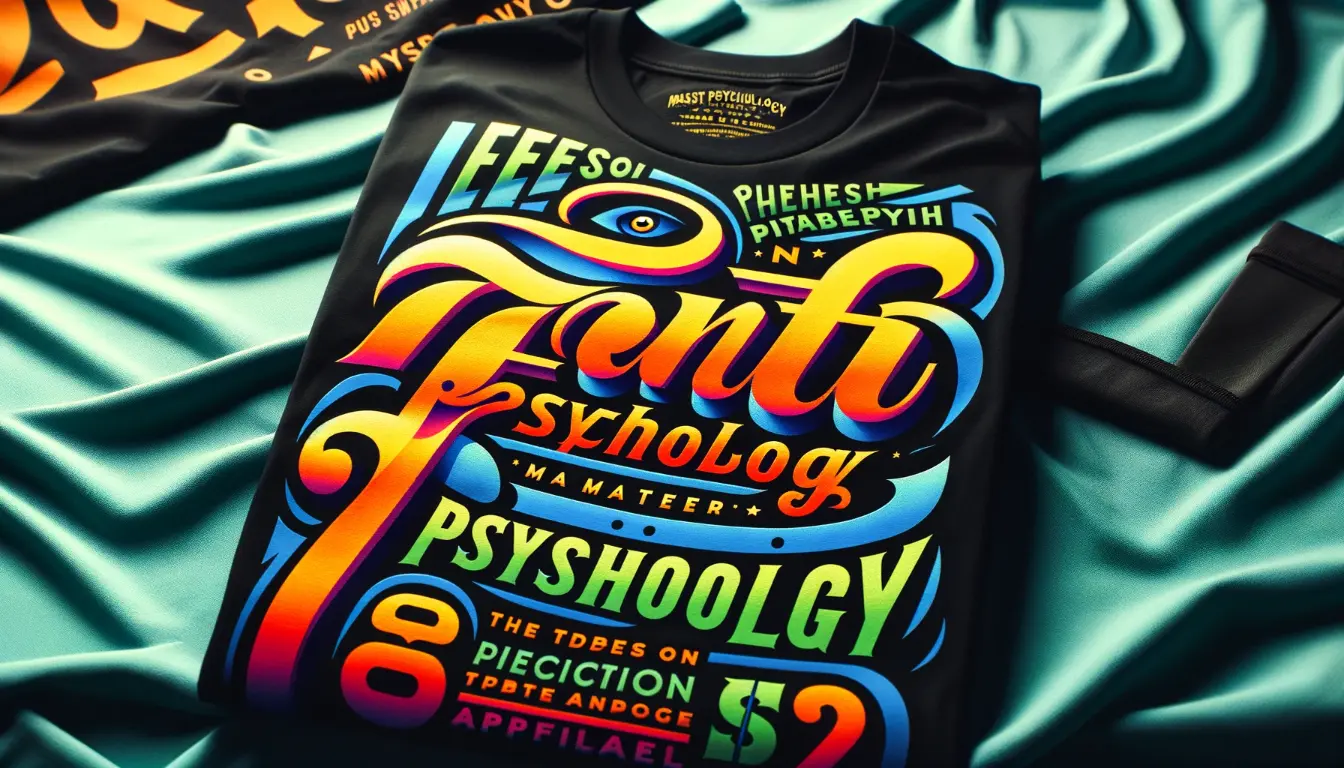
Script fonts: adding elegance and creativity
When it comes to font choices, script fonts offer a touch of elegance and creativity. These fonts are often associated with luxury brands, formal occasions, and wedding invitations.
Their fluid and decorative nature adds a unique charm to text or design, making them a popular choice for evoking sophistication and style. Whether used in branding or design elements, script fonts can help convey a sense of grace and refinement while setting the tone for an upscale and elegant feel.
Incorporating script fonts strategically can elevate the visual appeal of any content or design project, leaving a lasting impression on the audience.
Display fonts: making a bold impact and emphasizing individuality
Display fonts are a potent tool in graphic design, with the ability to leave a lasting impression on viewers. These fonts stand out boldly and help brands emphasize their unique individuality, making them instantly recognizable.
Leveraging the power of display fonts can carve a distinctive identity for brands, leaving a memorable mark on target audiences. Consequently, choosing the right display font becomes pivotal in brand differentiation and creating an emotional response from consumers.
Additionally, utilizing bold and impactful display fonts also plays an essential role in defining brand personality and awareness.
Different typeface families evoke various psychological effects that can influence audience perception and emotion regarding a brand’s message or identity. By leveraging the distinct visual impact of display fonts, brands can create powerful connections with their audience through typography alone, arousing emotions and eliciting strong responses.
Typography Best Practices
Use typographical emphasis and color psychology to guide the readers’ eyes and create uniqueness and consistency in typography. To learn more about how font choices can impact perception and emotion, keep reading for valuable insights into the world of font psychology on apparel!
Typographical emphasis and its impact on comprehension
Using bold or italic fonts can help draw attention to specific words or phrases, improving comprehension and memory retention rates among readers. Research shows that typographical emphasis plays a crucial role in guiding the reader’s focus and enhancing understanding of key points within the text.
This technique is especially beneficial for highlighting important information, reinforcing key concepts, and contributing to better overall comprehension.
The impact of typography on perception and emotion cannot be underestimated. The right typeface has the potential to significantly elevate a brand’s message, evoke specific emotions in the audience, and create a lasting impression.
Color psychology in font choice
Font colors have a significant impact on the emotional response of the audience. Warm tones like red and orange can evoke excitement, while cool tones like blue and green convey calmness.
The use of color in typography plays a crucial role in conveying messages and creating visual impact through font choice. It influences the overall perception of the message and is crucial for creating a cohesive and professional design.
Psychological effects associated with different colors influence how the audience perceives the brand or message. Considering these effects when choosing font colors can help create an emotional connection with the audience, enhancing brand recognition and engagement.
Font hierarchy for guiding the readers’ eyes
Guide the readers’ eyes and prioritize information by varying font sizes, weight, color, alignment, and spacing.
- Use larger font sizes for headings to capture attention immediately.
- Employ bold or italicized text for emphasis within the content.
- Utilize contrasting colors for important details or call-to-action elements to stand out.
- Ensure proper alignment of text to create a seamless flow and improve readability.
- Maintain appropriate spacing between lines and paragraphs for a visually pleasing layout.
- Incorporate bullet points or numbered lists for easy scanning and comprehension.
- Experiment with different font styles to distinguish between main content, subheadings, and supporting text.
Creating uniqueness and consistency in typography
Font choice plays a vital role in creating uniqueness and consistency in typography, contributing to brand recognition and capturing the audience’s attention. By selecting a unique typeface that aligns with the brand’s identity, companies can leave an indelible impression on their target market, distinguishing themselves from competitors.
Consistency in typography is equally crucial, as it builds trust with the audience and establishes a professional visual identity for the brand across various platforms. Utilizing consistent typefaces reinforces brand awareness, making it easier for customers to recognize and engage with the content.
The Impact of Typography on Perception and Emotion
The typeface used in design can significantly influence how a message is perceived, as well as evoke emotional responses from the audience. Understanding the psychological impact of different font styles and making informed choices can help to create a deeper connection with viewers and readers.
Influence of font choice on message perception
Different font choices significantly impact how a message is perceived and the emotions it evokes in readers. The style, size, and spacing of a font can convey professionalism with serif fonts, modernity with sans-serif fonts, playfulness with decorative or display typefaces, and elegance with script fonts.
Typeface selection plays a crucial role in shaping emotional responses from viewers and influences how people interpret and react to a brand’s message. This underlines the importance of careful consideration when choosing the right font to effectively convey the intended message and evoke desired emotions in the audience.
Readers’ perception of a message can be influenced by font choice, which has the potential to communicate different emotions and attitudes based on its specific design features. For instance, different types of fonts such as slab serifs, geometric sans serifs or blackletter have distinct personalities that can elicit varied emotional responses from viewers.
Memorable fonts and their visual impact
Fonts with unique characteristics and distinct personalities have a lasting visual impact on the audience. Certain fonts, such as Rockwell, Didot, or Futura Bold, stand out and are more memorable due to their boldness and distinctive features.
The use of these fonts can elevate the visual presentation of information, making it easier for audiences to recall and engage with the message being conveyed. Additionally, understanding the psychology behind memorable font choices can significantly enhance brand perception and audience engagement.
Eliciting emotions through font styles
Font styles have the power to evoke specific emotional responses from viewers. Different typefaces can influence how people perceive and react to a message or brand, playing a significant role in shaping customer connections with a brand.
Serif fonts convey authority and tradition, while sans-serif fonts exude modernity and simplicity. Script fonts add elegance and creativity to text or design, while display fonts make a bold impact by emphasizing individuality.
The impact of typography on perception and emotion is profound as font choices can elicit different emotions from viewers, influencing how they engage with content or branding material..
Conclusion
In conclusion, mastering typefaces on apparel requires understanding font psychology and its impact on brand identity. Different typeface families convey distinct emotions and perceptions, influencing how customers connect with a brand.
Employing typography best practices, such as color psychology and font hierarchy, can create uniqueness and consistency in design. The right typeface can evoke specific emotions, elevate a brand’s message, and leave a lasting impression on viewers.
Ready to master the art of typefaces on apparel? Start by harnessing the power of font psychology!
FAQs
1. What is font psychology and why does it matter for my apparel brand?
Font psychology dives into how different typefaces can make us feel—it’s all about giving your brand a personality that speaks to people. For example, slab serif fonts might come off as strong and sturdy, while modern sans-serif typefaces like Century Gothic appear sleek and clean.
2. Can choosing the right font really change how customers see my clothing line?
Absolutely! Fonts carry their own vibe—serif typeface might give off classic beauty, while bold sans-serifs shout modern and cool. It’s like handwriting; each style tells a story about your brand name. Pick fonts that match what you’re all about!
3. How do I know which font family will fit my brand identity best?
Think of your brand as a person—who would it be? Friendly humanist or no-nonsense neo-grotesque? Your instinct guides you here; choose fonts that reflect the essence of your apparel, whether it’s D&G-level luxury or comic sans casual.
4. Are some fonts better for certain types of clothes than others?
Sure thing—each piece has its mood! Got an affiliate program selling athletic gear on Amazon.com? Go with something energized like Gotham. Selling calligraphy tees in an email address newsletter? A softer script makes sense.
5. Does color play a role in how people react to the typeface on my shirts?
Color teams up with fonts to pack a one-two punch of meaning—think colour psychology! The right combo brings out the boldest part of your message, making folks remember you every time they dig through their closet.
6. What if I’m developing an app for my fashion store—is font choice still key there?
Oh, absolutely—the principles don’t change even if you use a low-code platform for app development! Your chosen typeface should harmonize with everything from product names to screen buttons because details matter just as much in digital spaces.